library(tidyverse)

diamonds |>
  ggplot(aes(x = cut, y = carat)) +
  geom_boxplot() +
  theme_bw() +
  labs(title = "Distribution of carat by cut in the diamonds data")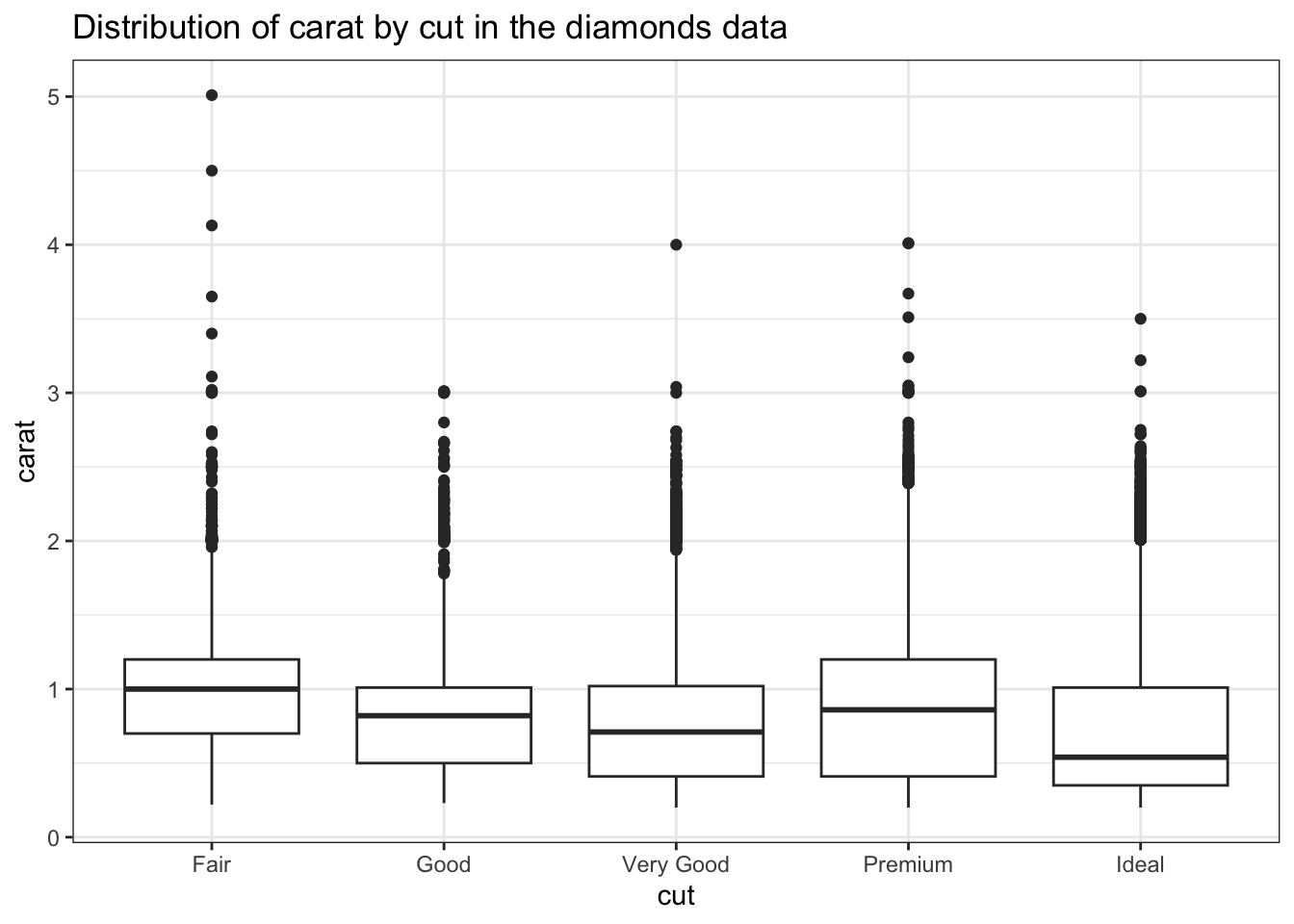
Instructions:
The code below creates side-by-side boxplots to show the distribution of carat for each different cut in the diamonds data:
library(tidyverse)
diamonds |>
ggplot(aes(x = cut, y = carat)) +
geom_boxplot() +
theme_bw() +
labs(title = "Distribution of carat by cut in the diamonds data")
group_boxplot which allows you to make side-by-side boxplots, given a data frame and the two variables to plot. Here are some examples of the function in action:library(palmerpenguins)
group_boxplot(diamonds, cut, carat)
group_boxplot(diamonds, carat, cut)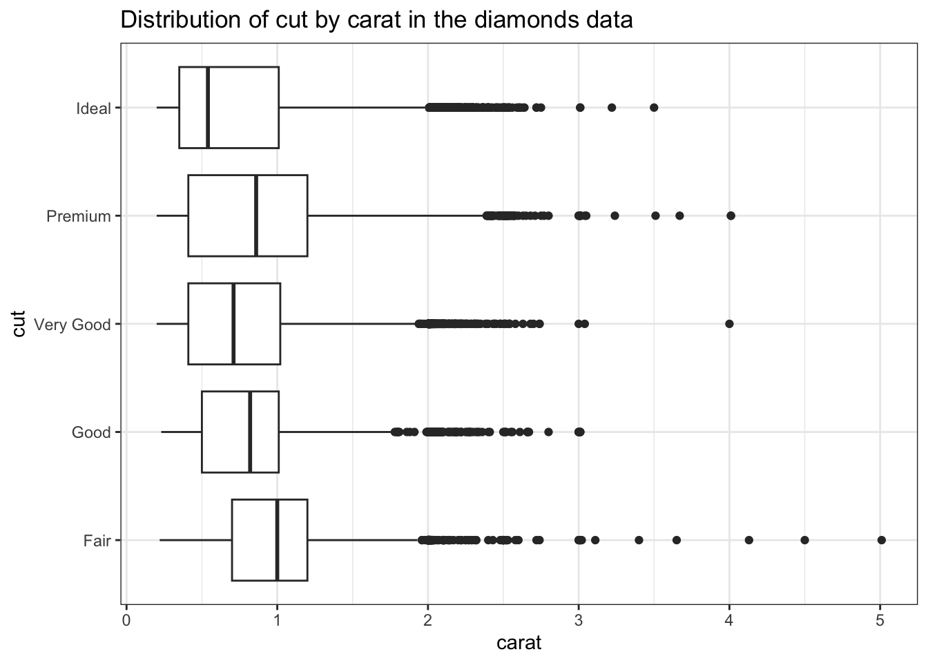
group_boxplot(penguins, species, bill_depth_mm)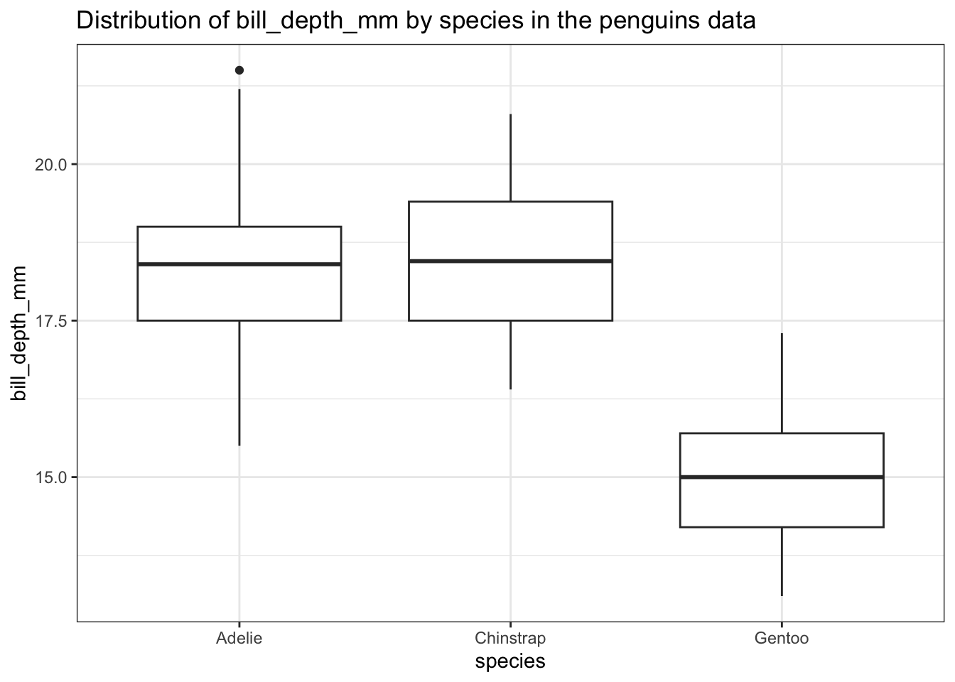
Hint: For titling the plots, see the examples with the englue function in Section 25.4.3 of R for Data Science (2nd edition).